

They weren't selling football.
Overview
A naming decision and brand architecture built on a single honest insight: nobody is really buying football coaching.
On The Ball is not really a football academy. It is a place where children become more confident, more capable and more comfortable in themselves. The football is the vehicle, but the real product is something harder to name and far more valuable.
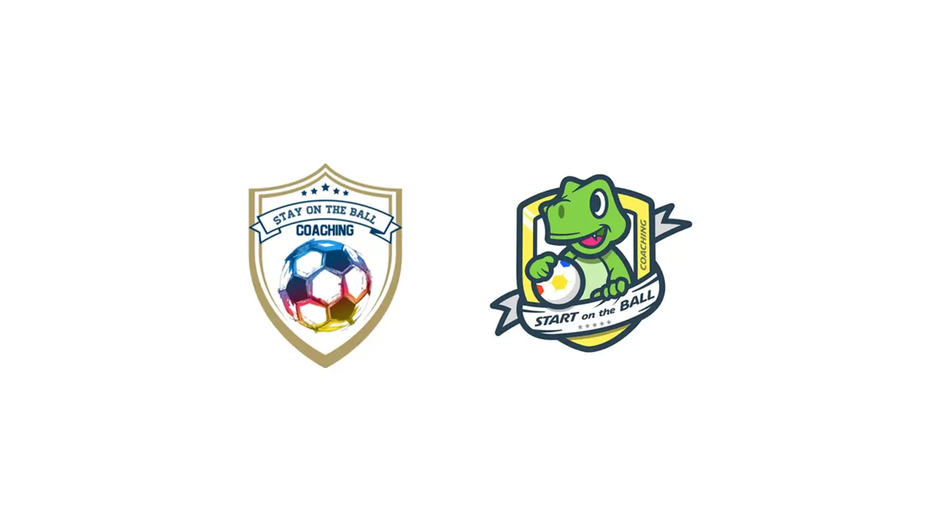
When Dean came to us, the business was called Stay On The Ball Coaching. The coaching was exceptional, but the brand did not reflect what it was actually doing to the people inside it.
We weren't there to add polish to what existed. The job was to build a brand system that told the true story, and a structure flexible enough to carry everything the business wanted to become.

The challenge
Stay On The Ball Coaching worked as a name, up to a point.
The problem was that it described an activity rather than an outcome, and it anchored the brand to a single offer in a way that made growth complicated. Any new product line had to work around the name rather than from it. The business had expanded instinctively, but the brand had no architecture to support what it had become.
It was also answering the wrong question. Parents choosing a coaching programme are not primarily asking "will my child get better at football?" They are asking something closer to "will my child come out of this feeling better about themselves?" The name gave no indication that the answer was yes.
Our thinking
The most important conversation was about what was actually being sold.
Technical coaching ability is a table stake in this market. Every credible academy can claim it (and does). But On The Ball was consistently producing something that went beyond technical improvement: children who had found their confidence, their place in a team, their willingness to try. Parents noticed, and it was the thing they talked about most, completely unprompted.
Confidence is one of the few qualities that compounds. A child who finds it through sport carries it into school, friendships and every difficult thing ahead of them. Selling that honestly, and building a brand that reflects it, is a very different proposition to selling passing and shooting drills.
The strategy followed from there: build a brand that speaks to what is actually on offer, and give it a structure that can grow.
Brand architecture
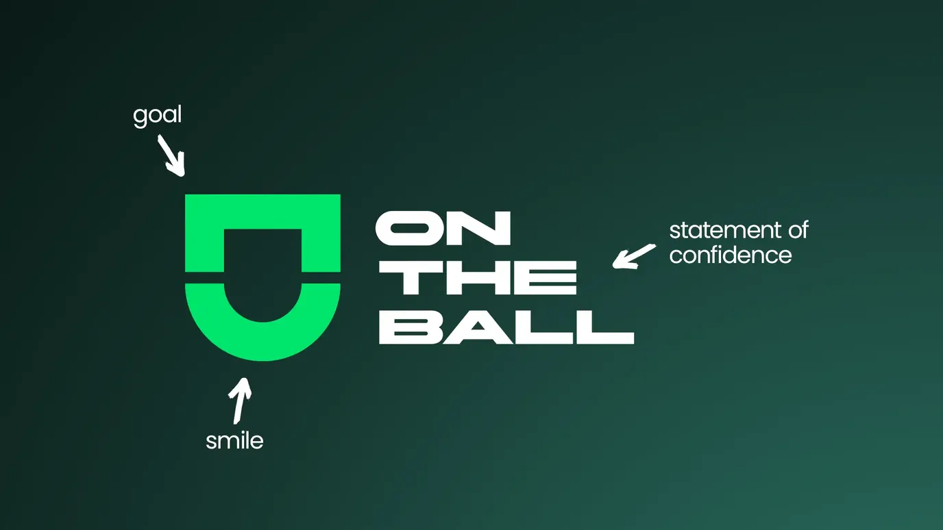
The first decision was the most consequential: the name. Stay On The Ball Coaching became On The Ball.
Shorter, cleaner and, crucially, neutral enough to anchor a full product family. From a limiting name that described one thing, we arrived at a parent brand capable of holding multiple distinct offers without contradiction.
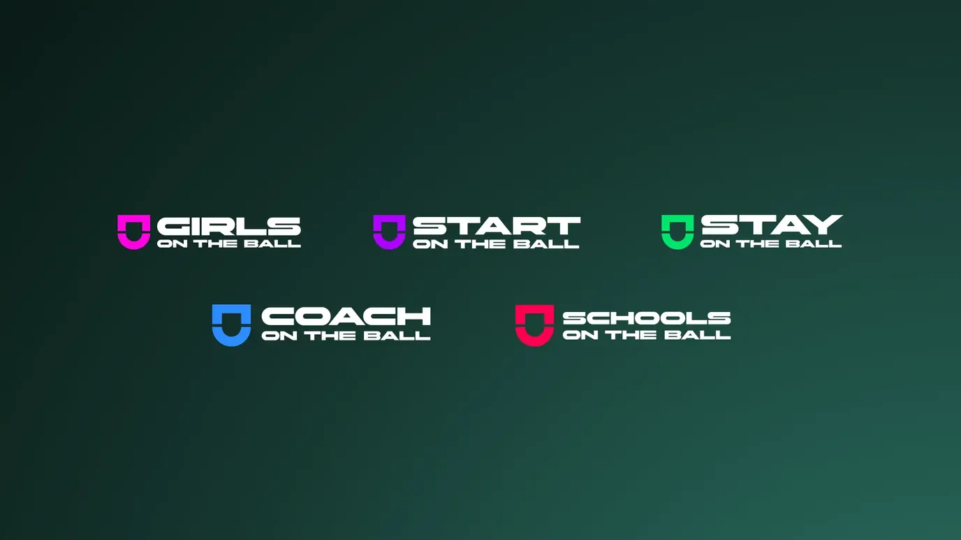
Underneath it the architecture built itself: Start On The Ball, Stay On The Ball, Coach On The Ball, Girls On The Ball, Schools On The Ball. Each product has its own identity, its own tone and its own audience. All of them are clearly part of the same family.
Identity design
The visual work was built around the same principle as the naming: distinction with coherence.
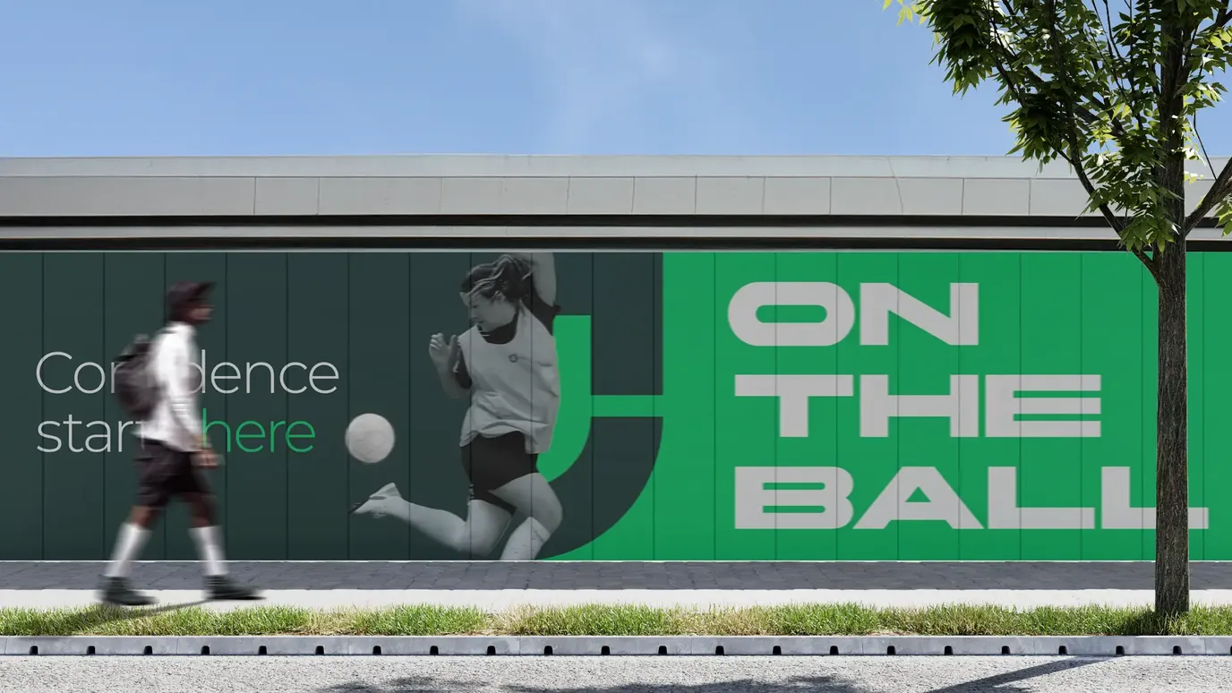
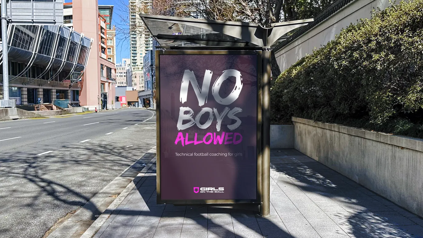
Each product needed to feel genuinely different from the others, appropriate to its specific audience, without ever losing its connection to the parent brand. The solution was colour: a distinctive palette for each product line, drawn from a shared system, so that the family relationship is immediate even when the individual expressions diverge.
The result is a brand that can grow in any direction without fragmenting. New products, new audiences, new partnerships: the architecture supports all of it without needing a reinvention each time.

Web design
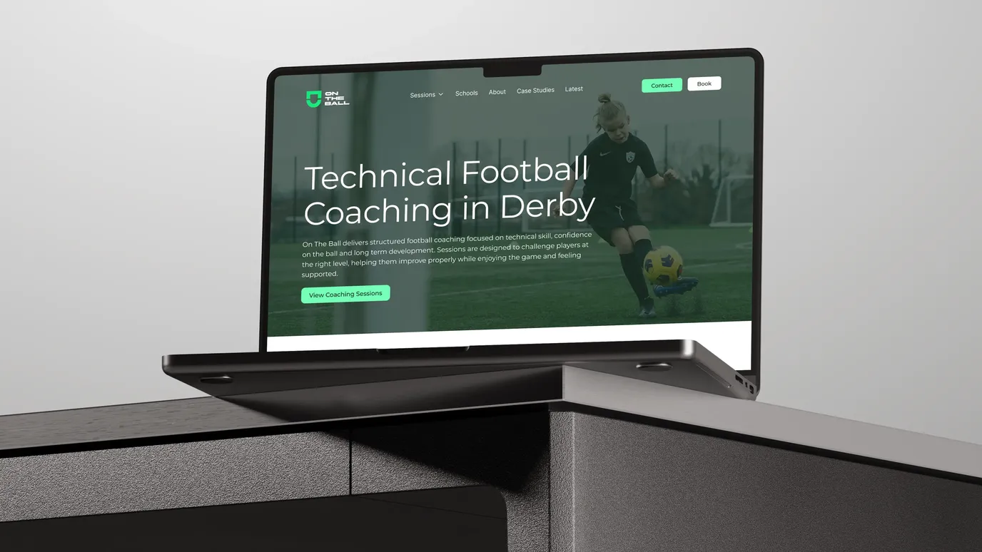
A new brand architecture is only useful if people can find it. The website was built to make sure they could, and that when they did, they stayed.
The brief was conversion-first, in the honest sense: get the right parents to the right product and into a conversation with Dean as quickly as possible. The site moves people towards WhatsApp, and every page has a job.
Each product line has its own space. Start On The Ball sits alongside Girls On The Ball without competing with it. Schools On The Ball speaks to a completely different audience without feeling like a different business. The structure of the site follows the architecture of the brand, so simply finding your way around it reinforces the logic of the whole thing.
There is also room for case studies and editorial content. Parents researching options online are looking for more than a price and a location. They want evidence that this will work, and On The Ball has plenty.
What changed
682%
Rise in unique visitors to the website in the first two months after launch, compared with the old site.
327%
Rise in pageviews over the same period.
5
Programmes now sitting under one brand, each with its own audience.
The outcome
Those numbers matter, but the one that matters most isn't on the dashboard. On The Ball is now running at capacity.
That's a business metric, and it's the only one that really counts. The name change, the architecture, the visual identity and the website were all in service of filling sessions with the right children, and giving parents enough confidence to make the call.
The most powerful brands are honest about what they are really selling. Football academies sell football. On The Ball sells confidence. Once the thinking is honest, the design follows.