

From icons to identity.
Overview
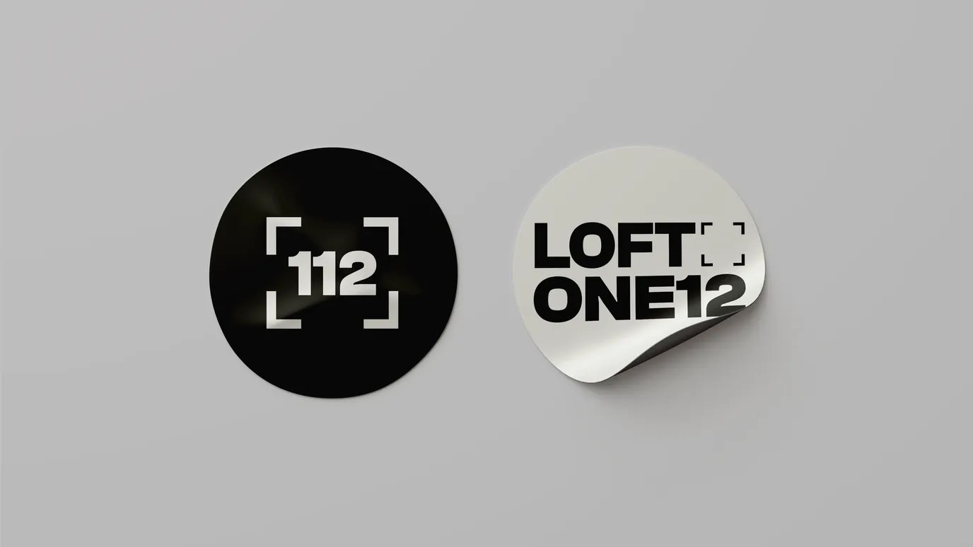
What started as a job to build out iconography for Loft One12 quickly became wider in scope and purpose.
When Loft One12 first approached us, the brief sounded simple: design a set of social media icons. As with many projects, that small ask opened the door to a much bigger challenge.
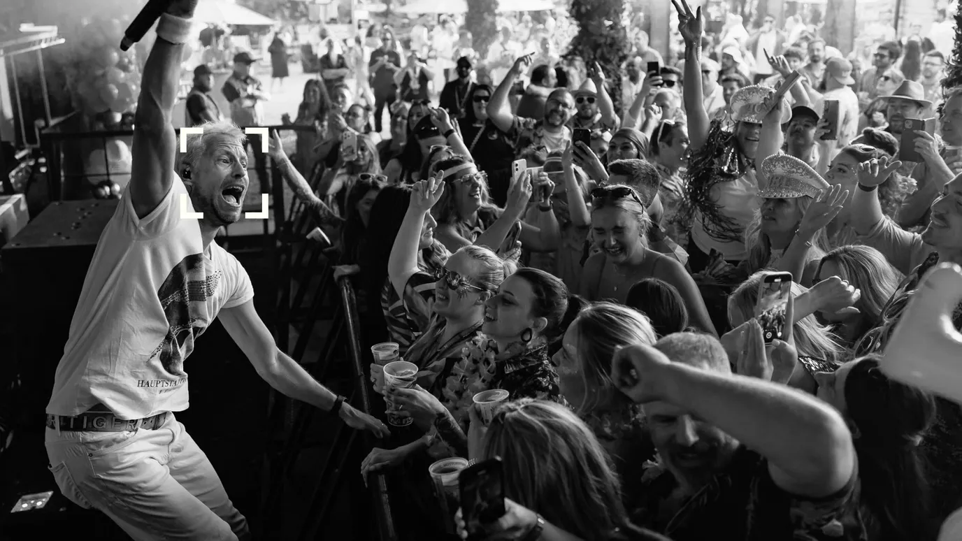
Icons weren't the problem. Their brand didn't have a consistent voice. Each touchpoint looked and felt slightly different. Their logo, their social assets, even the way type and colour were being used, all pulled in different directions. For a creative studio built on storytelling through photography, videography and podcasting, that lack of cohesion was holding them back.
The challenge
Through our discovery process, it became clear that Loft One12 needed more than icons. They needed a brand identity that could tie everything together and make their work instantly recognisable across every platform. That meant stepping back, digging into their purpose, and finding a visual system that could scale.
The idea
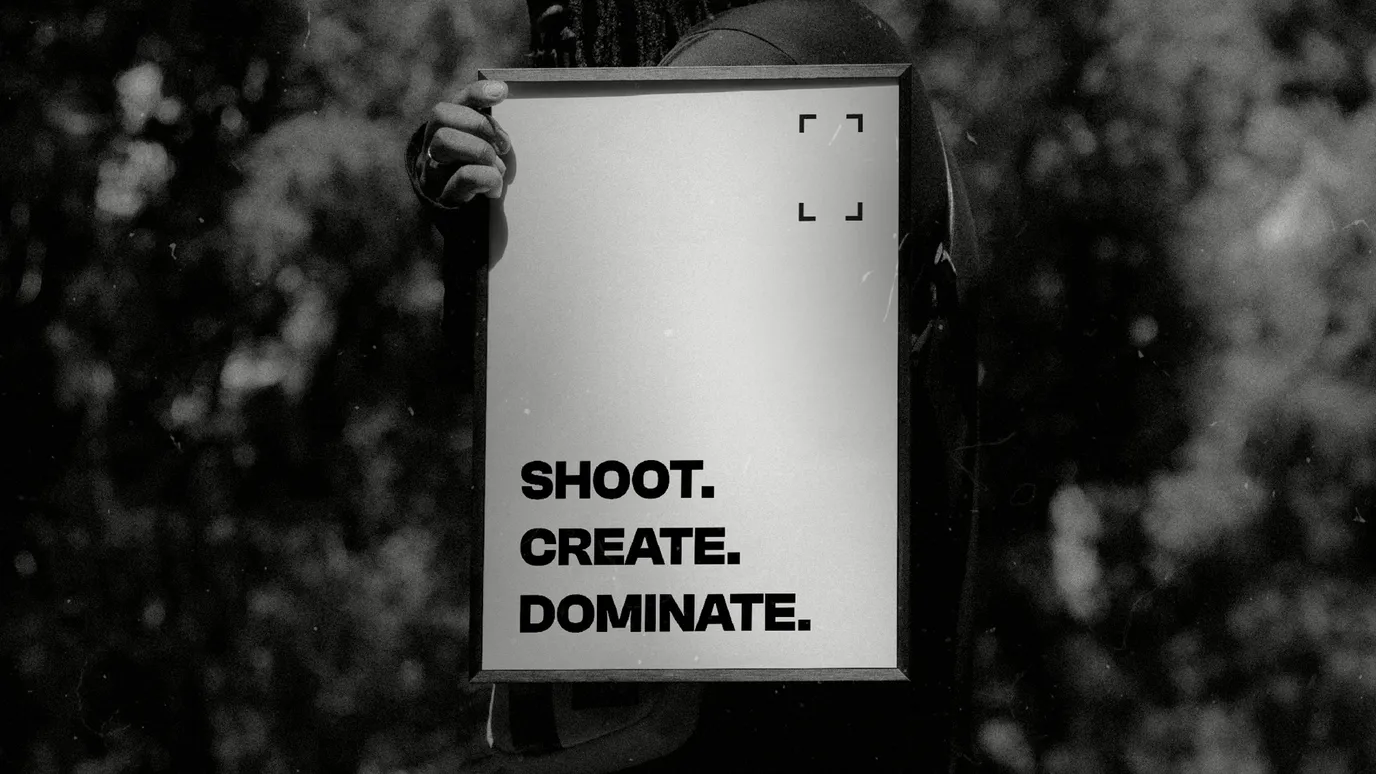
The idea that unlocked the project was the viewfinder.
In photography, it's the literal frame that captures the shot. In video, it's how a story is composed on screen. In audio, it becomes a metaphorical tool, focusing on the voices and moments that matter while filtering out the noise.
The viewfinder captured the essence of Loft One12's work: clarity, perspective and storytelling across different mediums. It became the foundation for the refreshed brand identity.
The system
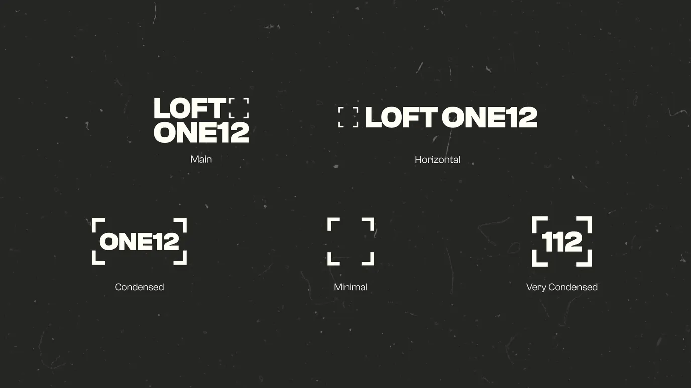
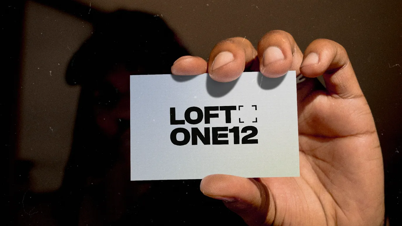
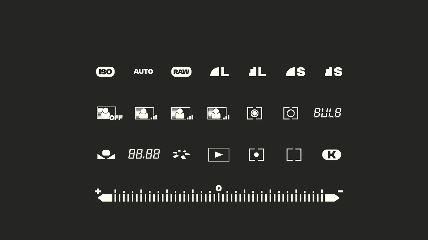
With that device in place, we reimagined the visual system from the ground up. The logo was updated to be more versatile, with lockups that worked in different formats and contexts. The typography paired Clash Grotesk Variable with Overtime LCD, creating a bold but adaptable system that could flex from headlines to captions. A refined colour palette brought balance, combining warm and cool tones with a grounding off-black.
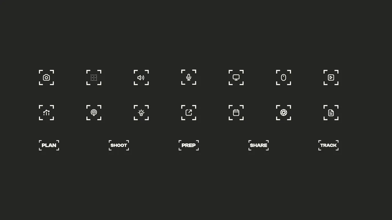
And yes, the social media icons were designed, but as part of a unified toolkit rather than standalone assets.
The outcome
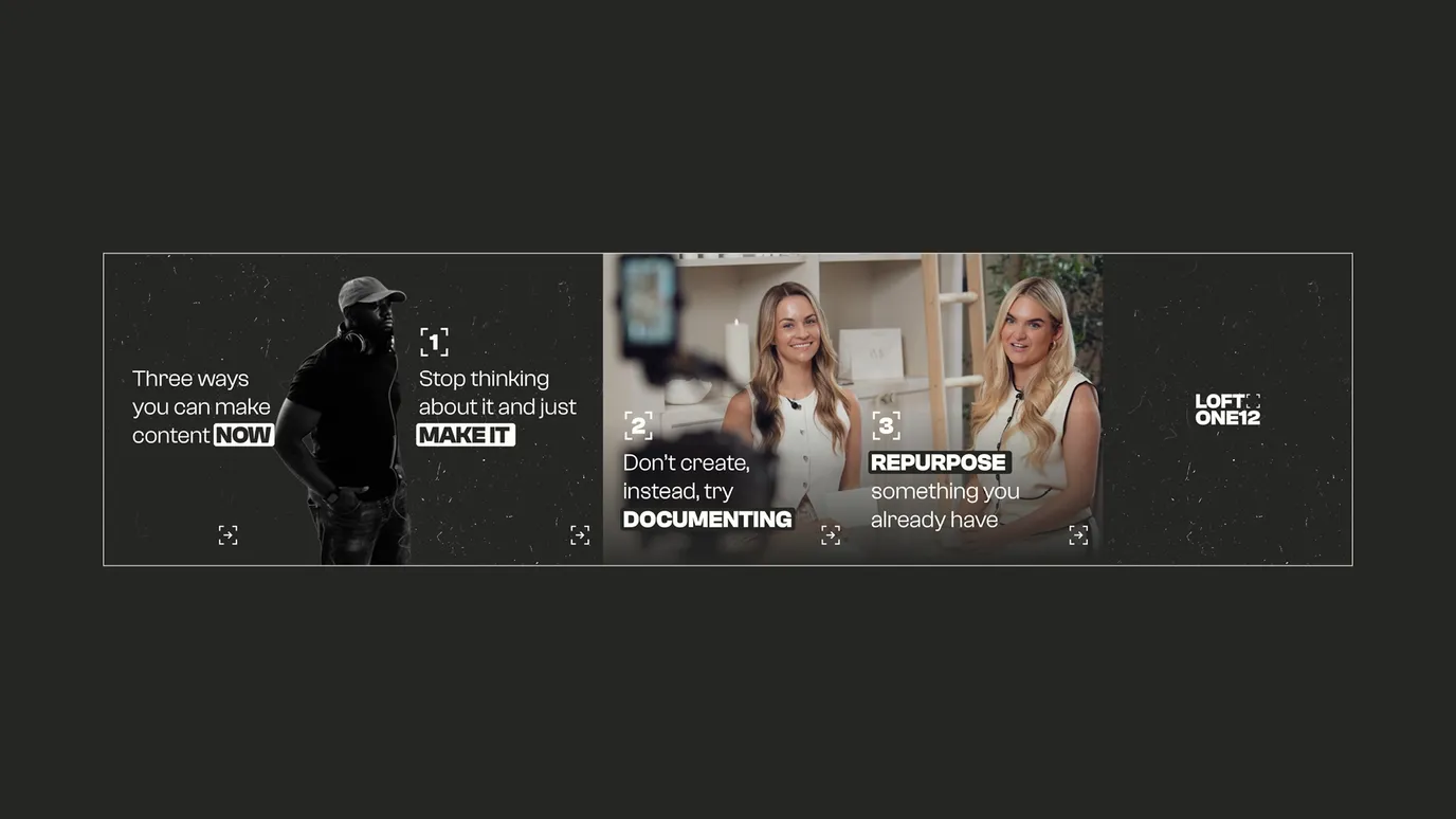
Loft One12 left with a clear and consistent brand language, one that could run across logos, icons, social media carousels and every other touchpoint.
Instead of piecemeal visuals, they now have a system that speaks with one voice. That consistency builds recognition, strengthens trust and makes every piece of content more effective.
What started as a request for icons turned into a full brand identity project, and it shows up consistently across platforms, reinforcing what they do best: framing stories in a way that connects.