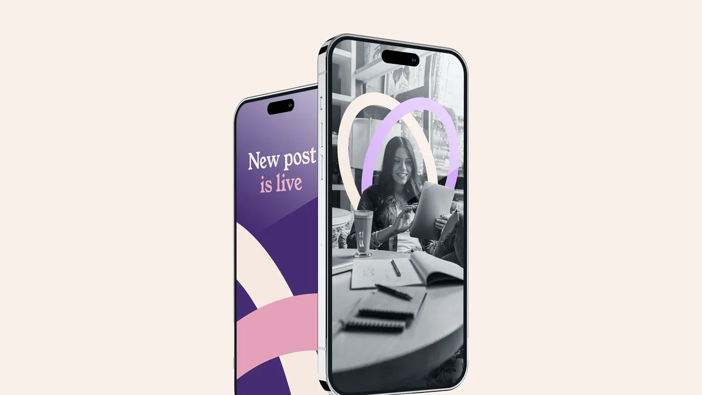


More of you.
Overview
A web and identity project showing that a warmer, more human brand can outperform a corporate one by signalling the right things.
More of You was about moving away from a brand that felt distant, corporate and emotionally vague, and replacing it with something that reflected the person behind the work, the way she supports people, and the care at the heart of what she does.
We weren't adding features, pages or complexity. We were changing how the brand feels to encounter, so the right people recognise themselves in it and feel confident taking the next step.

The challenge
When Janet came to us, she already had a brand and a website, but neither were really working.
The identity felt cold and generic, borrowing visual language from traditional consultancy brands without ever clearly saying what Practically Leading stood for or why someone should trust it with something as sensitive as leadership and funding. The website, while functional, felt tired and unfocused, doing very little to guide people, prompt action or support future growth.
More importantly, none of it reflected Janet herself, her values or the way she works with people, which left a growing gap between who she is and how the brand presented her.
Our thinking
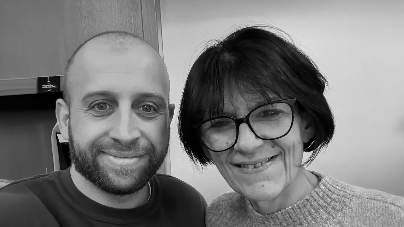
Before touching visuals or layouts, we spent time understanding Janet's motivation, the experiences that shaped her work, and why she cares so deeply about the organisations she supports.
Her expertise was obvious, but her biggest strength turned out to be empathy. She is thoughtful, patient and driven by a genuine desire to make complicated, often stressful processes feel calmer and more manageable for the people involved.
So the strategy was to make the brand more honest, more human and closer to the emotional reality of the people coming to her for help.
Identity design
The identity was built around connection and partnership, expressed in a way that feels confident but never corporate.
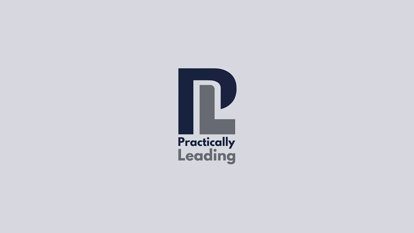
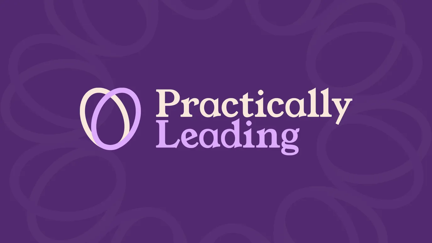
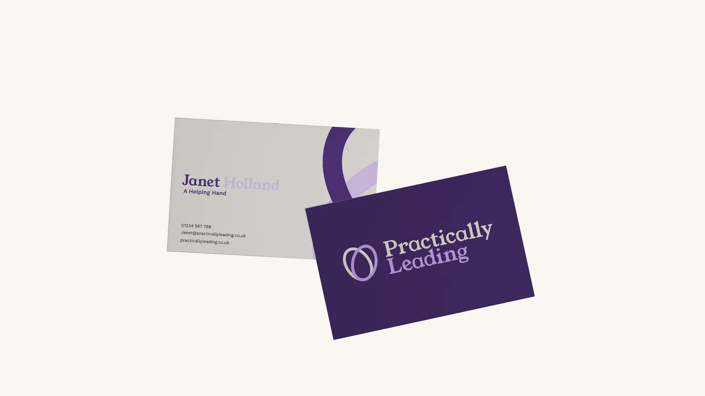
At the centre of the brand is a simple mark formed from two shapes coming together to create a subtle heart, a visual shorthand for care, collaboration and shared progress that mirrors the way Janet works with her clients.
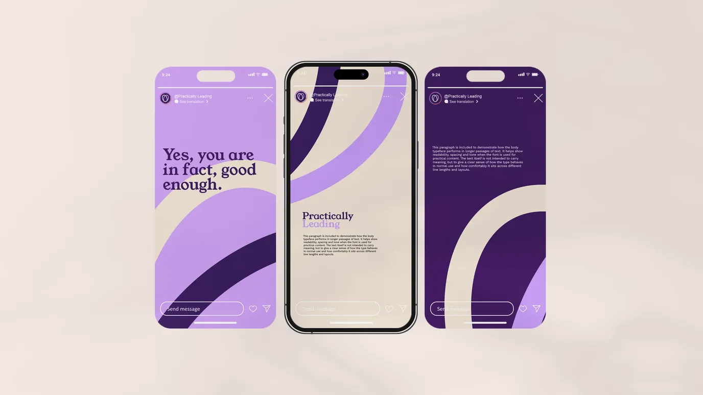
The wider system balances warmth and clarity, using confident colour, considered typography and plenty of breathing space. It feels modern, grounded and approachable, and it stands apart in a sector dominated by safe, traditional visual language.
Web design
Rather than rebuilding a large, complex website, we took a deliberately restrained approach.
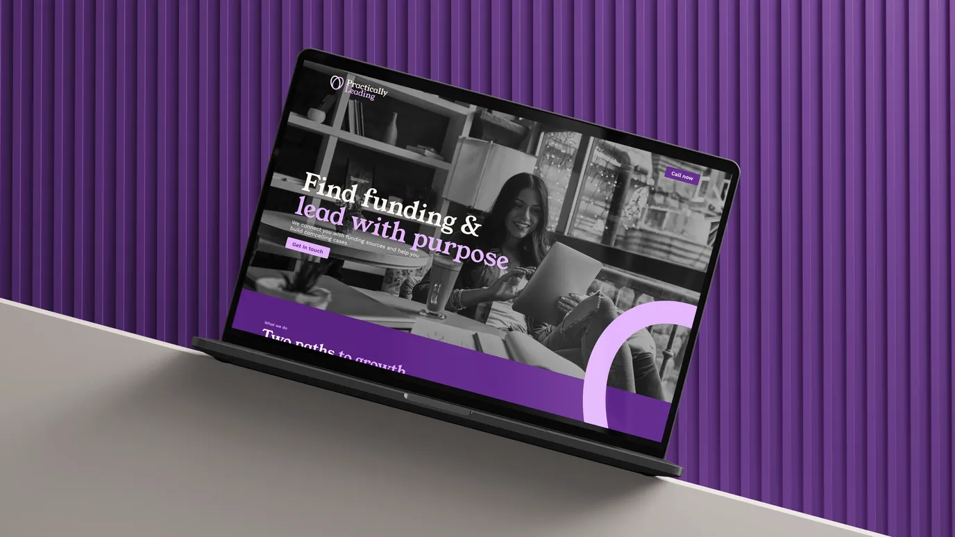
We designed a focused one-page site with a clear structure, simple messaging and repeated opportunities to get in touch, so visitors can understand the offer quickly without feeling overwhelmed. It only had to give the right people enough clarity and confidence to take action.
The site was built on Storyblok, giving Janet a flexible foundation that can grow into a full multi-page site if and when the business needs it, without forcing her to overspend or overcommit upfront.
A smarter setup
Every decision in this project was made with long-term practicality in mind. By simplifying the site structure and choosing the right technology, we reduced ongoing costs, lowered maintenance and avoided building features that weren't yet needed, while keeping the platform ready to scale when the time is right.
The outcome
Most importantly, the brand finally feels like her.
Practically Leading now has a brand that reflects Janet's values, personality and way of working, supported by a clear, confident website built around trust and ease of engagement.
The identity stands out in a traditionally corporate sector, the site is doing a clearer job of turning interest into conversation, and the foundations are in place for the business to grow without having to start again.
Small, well-considered decisions can have an outsized impact. Clarity, care and restraint are often the most effective design tools you have.