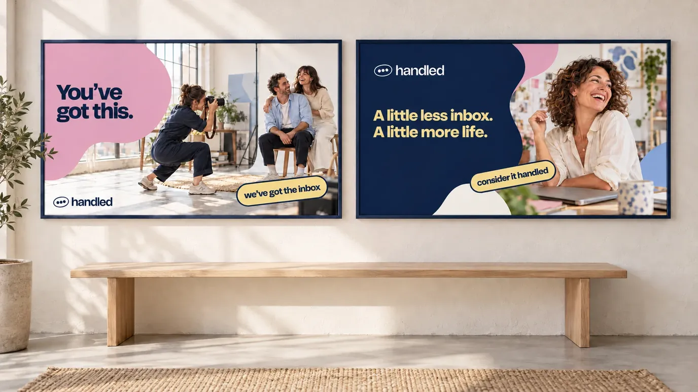


A little less inbox. A little more life.
Overview
A new name and a warm identity for a team helping small business owners put their phones down and get a bit of their day back.
When you run a small business, the messages tend to come with you. Into the evening. Onto the sofa. Along to whatever you were hoping to do once the working day was finished.
Ashley Barton and the team had a business built around helping with that. They take care of the social inbox, answering enquiries in the owner’s voice so there’s a bit more time for everything else. We helped them find a name, a voice and an identity that made the idea feel easy to say yes to.
Someone you can hand it over to
Photographers were an important audience for Ashley. And for a photographer, an enquiry is often the beginning of something quite personal. A wedding. A family portrait. Someone asking you to capture a moment they’ll want to keep.
Those conversations matter. So does the way you have them. If you’ve spent years building a business around your own approach, letting somebody else reply to your customers can feel like a big step.
We kept coming back to the feeling Ashley wanted people to have: warm, human and safe. The brand needed to give people a sense of who was helping them, and make the handover feel comfortable.
Consider it handled
The business came to us as EnquiryCX. There was a useful idea behind the name, but we wanted something Ashley could say to a photographer and have it land straight away.
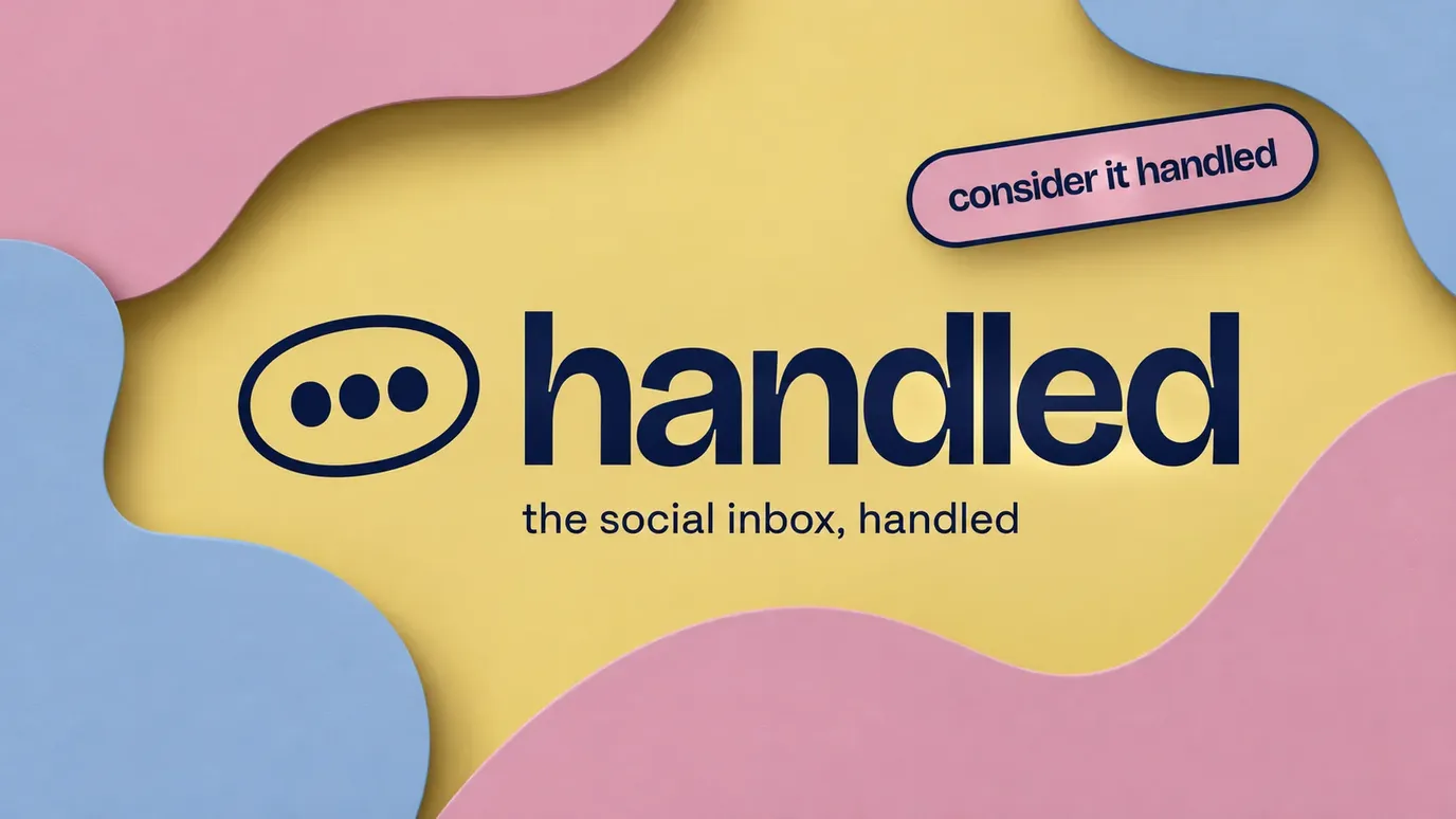
Handled felt right. It’s a word you use when somebody has taken something off your mind. You can get on with what you were doing. They’ve got it.
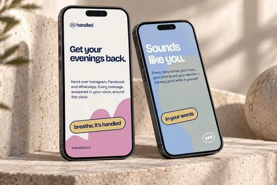
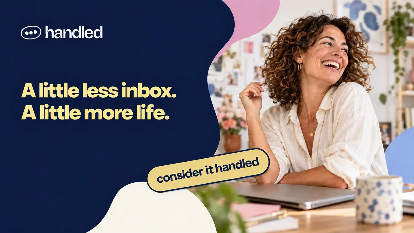
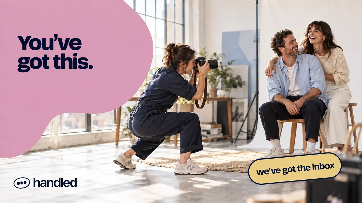
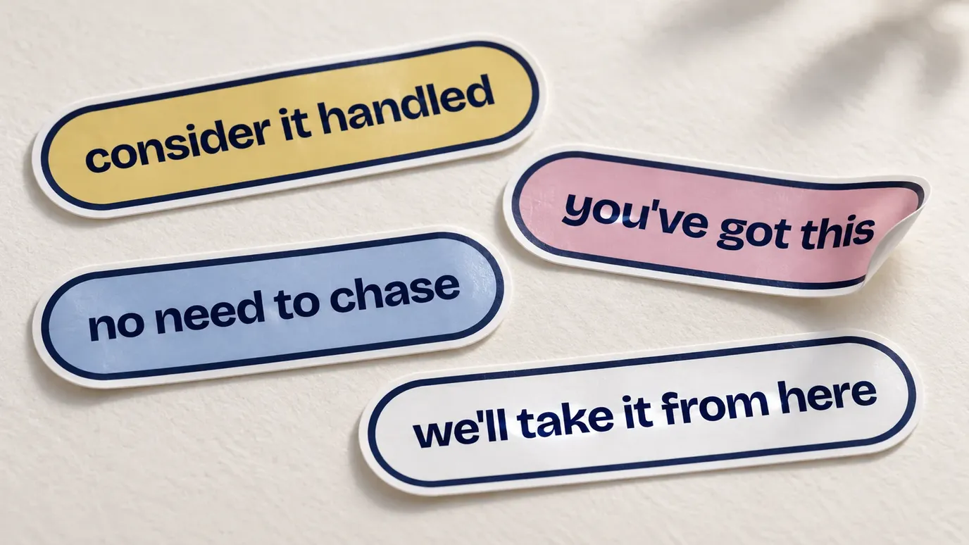
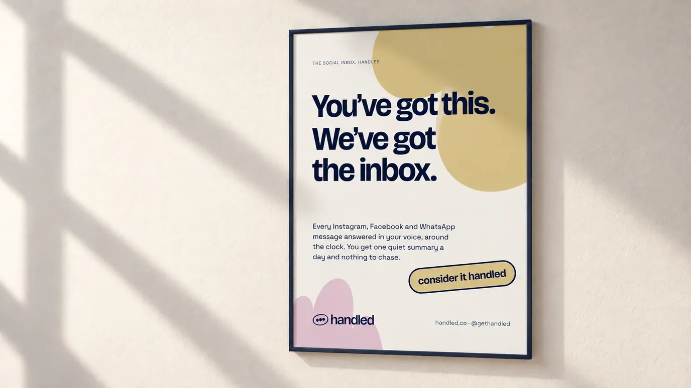
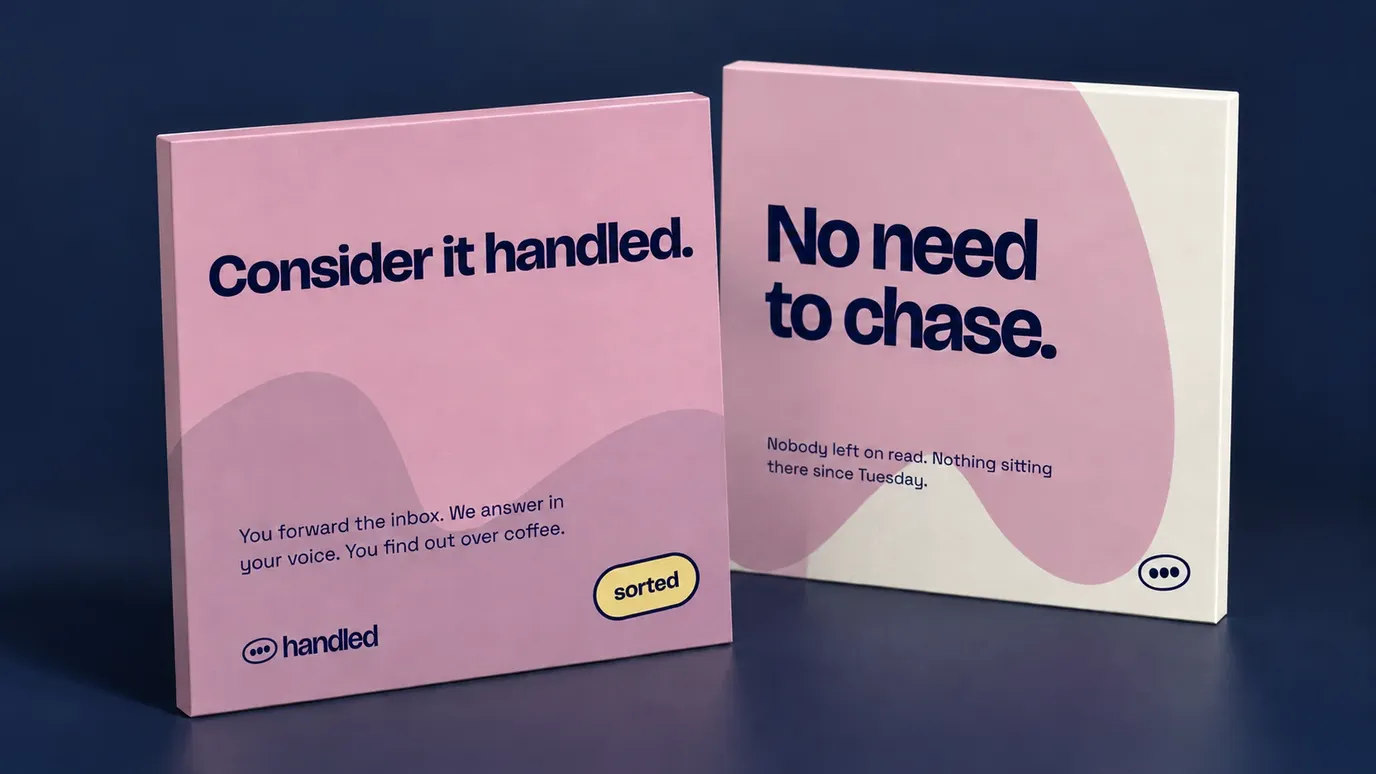
It also gave us plenty to work with in the writing. “We’ll take it from here.” “Sounds like you.” “You’ve got this. We’ve got the inbox.” Little bits of reassurance, each speaking to a slightly different part of the decision. Will my customers be looked after? Will the replies still sound like me? Can I actually put my phone down?
A bit of warmth goes a long way
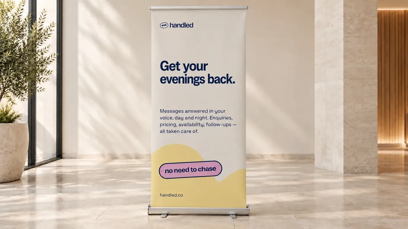
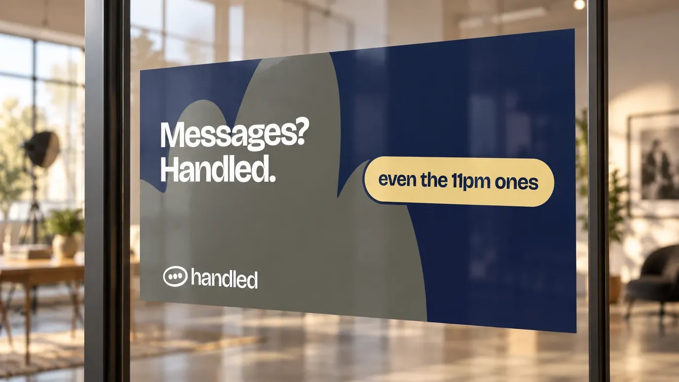
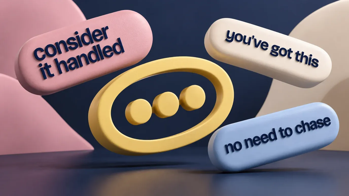
We liked the idea of an identity that could be confident and still feel friendly. Deep navy gives the words somewhere solid to sit, with softer yellow, pink and blue bringing warmth around them. The headlines have plenty of personality, and the supporting type leaves the information easy to read.
The little oval with three dots comes from conversation. It’s a simple thing, but it feels familiar. We brought that softness into the shapes around it, then added phrases on pill-shaped stickers, as though someone had popped a helpful note into the design.
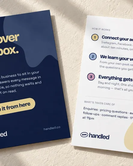
There’s room for the brand to have some fun. There’s also room to explain what Handled does. A big headline might catch your attention; a leaflet needs to help you understand how it could fit into your working day. We wanted the identity to feel at home doing both.
Back to the good stuff
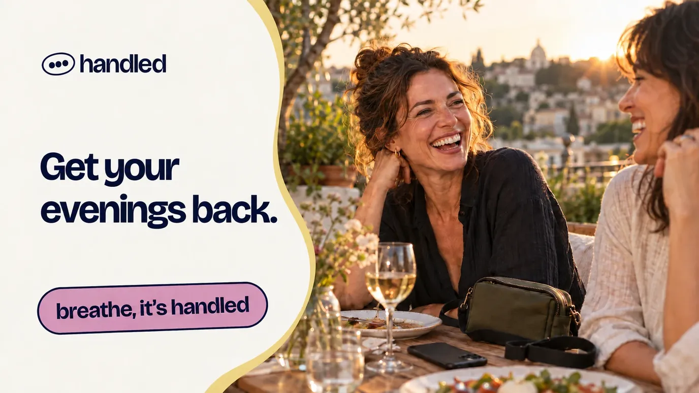
An evening with your family. Time to concentrate on a shoot. A meal where your phone stays in your pocket. Those are the things behind the promise of giving someone their time back, and they gave the messaging somewhere to start.
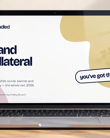
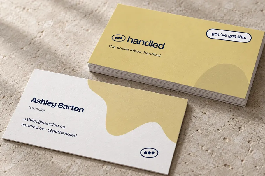
We carried the brand into cards, leaflets, presentations and social templates, with guidelines and a Canva kit to help the team use it day to day. The phrases, colours and shapes give them plenty to play with, while keeping the whole thing recognisably Handled.
For us, the lovely part of this project was how much sat behind such a small word. Ashley and the team were offering to take care of something that follows business owners around all day. Our job was to help people feel comfortable letting them.
A little less inbox. A little more life.