


The work was already there
Overview
An established contractor gives its website and brochure the same confidence clients already have in the team.
Derbyshire Contracting Services has been getting on with the job since 1998. Groundworks, tarmac, concrete, drainage, ducting and, more recently, EV infrastructure. Based in the East Midlands, working nationwide, and family-run throughout.
Much of its business came through repeat work and word of mouth, which tells you something about the people doing it. Clients knew what DCS could deliver because they had seen it happen. Anyone arriving at the website had rather less to go on.
We were asked to build a new site and create a brochure that gave the business a clearer introduction. The experience, the capabilities and the evidence were all there. They needed bringing together.
The Challenge
The old website was a single scrolling page from 2018. It had project photography, a list of services and information about the company, but updating it was difficult. At our kickoff meeting, DCS reported that it wasn't bringing in enquiries either.
The bigger problem was what people took away from it. Potential clients didn't always realise how many services DCS offered, which accreditations it held, or that a Derby-based company worked across the country. A business capable of substantial commercial work could still be read as a contractor for smaller local jobs.
DCS wanted more of the right relationships, particularly with larger commercial clients commissioning tarmac and concrete work. The website needed to help those people recognise a suitable partner before the first conversation.
Our Thinking
Choosing a contractor means putting part of your project in somebody else's hands. The person making that decision has a programme to protect, a site to keep running and questions they will need to answer if things go wrong.
That shaped our discovery work, customer profiles and desk-based UX research. We considered the main contractor assembling a dependable supply chain, the facilities manager planning work around an operational site, and the public-sector buyer checking credentials. Each arrives with a different job to do. All need evidence that DCS can do theirs.
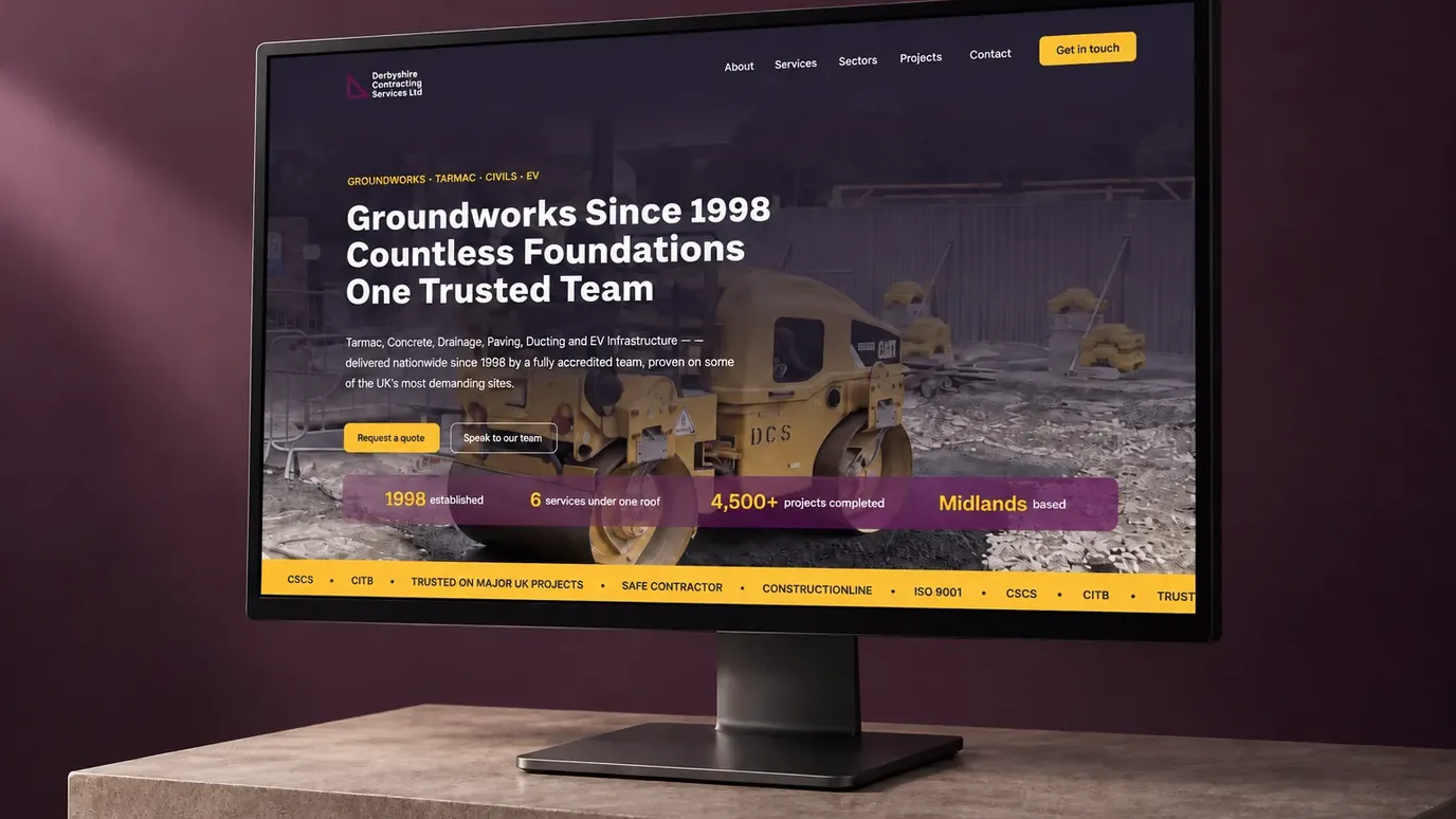
So we organised the site around the things those buyers need to understand: services, sectors, relevant projects and credentials. The breadth of the business became easier to see. Its experience became easier to assess. Contact became an obvious next step.
Giving the Work Some Context
Construction photography can tell you a great deal about a job, provided you know what you are looking at. A finished surface, an excavation or a row of charging bays means more when it sits alongside an explanation of the work involved.
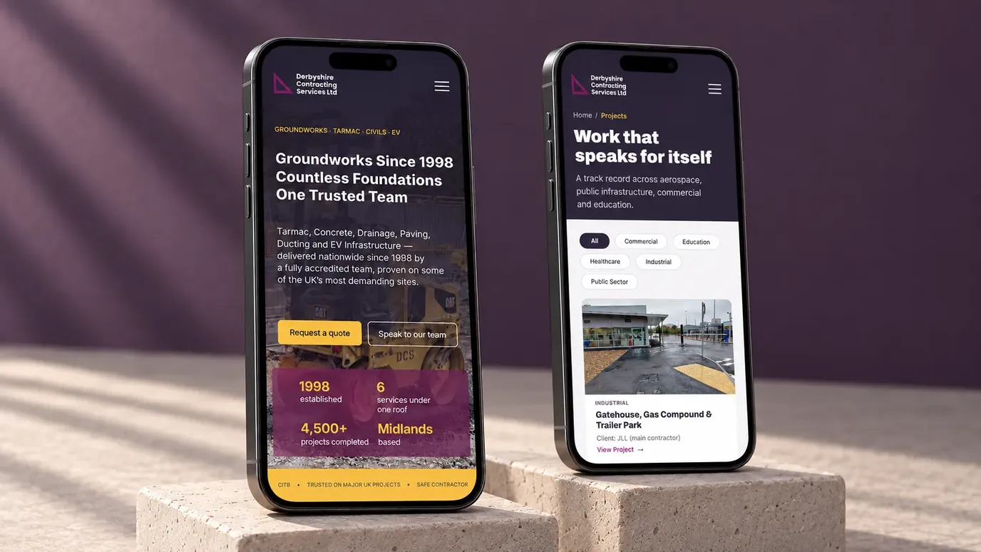
The new site gives projects that context, with individual pages and real site photography. Dedicated service pages explain the different disciplines, while sector pages give visitors a route into the part of the business relevant to them.
Accreditations and downloadable policies support the practical work of supplier checks. Clear routes to request a quote or speak to the team let people act once they have found what they need. The structure follows the decision, from understanding the offer to seeing the evidence to getting in touch.
The Design
DCS already had an identity. We built from it, giving its plum colour a stronger presence across the website and using gold to pick out key information and actions.
Bold typography gives the pages a clear hierarchy. Construction photography keeps the presentation connected to the work, with the team, machinery and sites doing much of the explaining. The result has enough presence to introduce an established commercial contractor, while keeping the content straightforward to navigate.
A visitor should leave with a useful understanding of DCS: what it does, where it works and why it is worth a conversation.
In Print
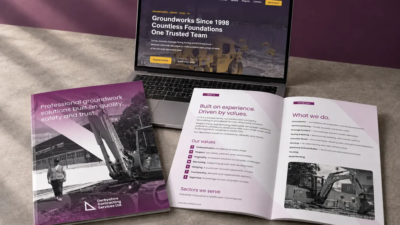
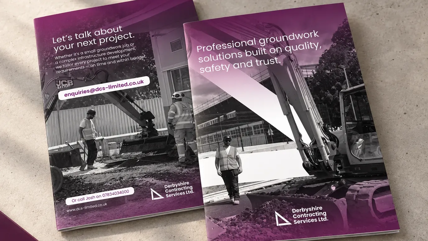
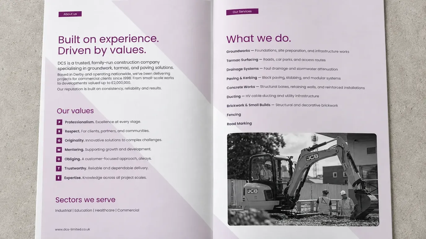
The brochure carries that introduction into four pages. Quality, safety and trust lead the cover; the inside brings together the company story, values, sectors and services; the back gives the reader a direct way to get in touch.
Plum, monochrome construction photography and a diagonal graphic drawn from the logo give the print a recognisable connection to the existing identity. The format asks us to be selective. There is enough detail to introduce the business, with a clear route to continue the conversation.
It gives DCS something tangible to put in someone's hands, alongside a website they can explore afterwards.
The Outcome
DCS now has a new website and a brochure that make its capabilities easier to understand and present. Services have space of their own, project photography has context, and the credentials buyers need are easier to find.
The business brings the experience. Its presentation now gives that experience a clearer introduction.
What we reckon
A reputation built through repeat work can become so familiar inside a business that people forget how much a new customer still needs to learn. The team knows the range of services. Existing clients know the standards. Somebody visiting for the first time needs to be shown both.
That was the job here: take what DCS had earned over years of work and give it a form people could understand before picking up the phone.
Solid foundations are useful things to have. It helps if people can see them.